The room journal
Restaurant furniture finish samples: comparing them in the actual room
Restaurant furniture finish samples are most useful when they are compared where the furniture will be seen. A small reference on a desk can help identify a color or texture, but the room adds neighboring materials, light, and much larger areas of surface. Give the comparison that context before calling a finish settled.
The process does not need a crowded board. Begin with the exact product options under consideration, the fixed materials that will remain, and a clear question for the review. You might be checking whether two wood tones can sit together or whether a seat color works beside a chosen tabletop.
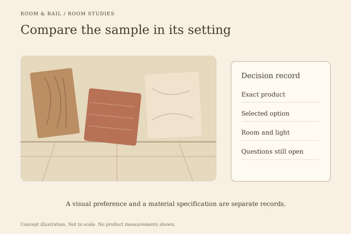
Open diagram at full size (new tab) ↗
Identify the sample before judging the appearance
Keep the product name, option label, and source of the sample attached to it. A loose swatch can become difficult to trace after several alternatives have been discussed. Similar color names across different products do not establish an identical material or finish.
Read the product's stated construction alongside the reference. The materials page helps distinguish a visible effect from the actual material description. A sample that looks like wood grain should not be recorded as solid wood unless that is what the selected product specifies.
Save the intended option on the finish board rather than relying only on a note. If the sample represents a choice not currently confirmed for the model, keep that question open. A visual preference is not proof that the configuration is available.
Set one comparison question at a time
Place the relevant references together and state what needs a decision. Comparing a chair seat with a table surface is a different task from deciding between two whole-room palettes. Mixing those questions can lead to a board that looks rich but leaves the actual choice unclear.
For example, compare the proposed chair finish with the existing floor first. Then add the tabletop and examine the new relationship. A finish that works against the floor alone may need another review when the larger table surface enters the scene.
Keep rejected alternatives nearby but visibly separate. This allows the team to understand what changed without accidentally treating every swatch as part of the approved palette. A simple version name and a date in the wider project record can prevent confusion later.
Bring fixed materials into the review
Walls, flooring, millwork, and counters remain part of the palette even when they are outside the furniture order. Use actual references when available. If a fixed finish has not been selected, record that uncertainty instead of treating a placeholder image as final.
Place the samples in the intended room or near the materials they need to relate to. A close wood-tone comparison is easier to assess when both references are present. Memory is a weak substitute for the actual surfaces, especially when the difference is subtle.
The shape and proportion guide adds another part of the review. A material relationship can be appealing while the furniture outline still feels wrong beside the room's fixed elements. Keep the sample test connected to the full product, not detached from its shape.
Change the light before changing the finish
View the references under the conditions that matter to the restaurant. If the room is used in daylight and under evening lighting, compare both where practical. Note which conditions were reviewed so another person can understand the basis of the decision.
Photographs can help record the arrangement, but they should not become the only proof of a close color match. Camera processing and screens can alter the appearance. Keep the physical reference available when the final relationship depends on a small difference.
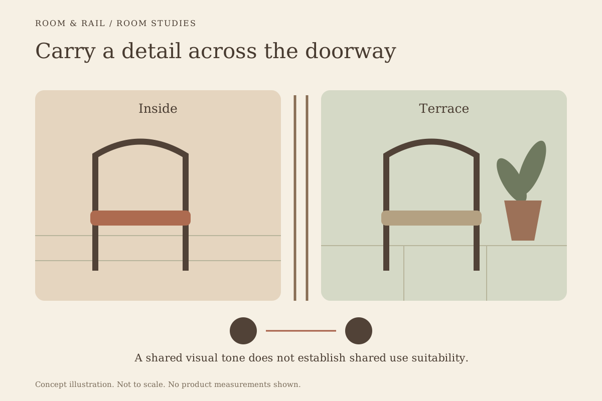
For a terrace connected to the interior, review the indoor and outdoor palette from both settings. The products may have different material requirements even when the colors are intended to relate. Preserve those product-specific details throughout the comparison.
Consider how much of each finish will be visible
A seat swatch and a booth upholstery sample may occupy similar space on a board but represent very different areas in the room. Do not let equal-sized samples imply equal visual importance. Describe where each material will appear and how broadly it will be used.
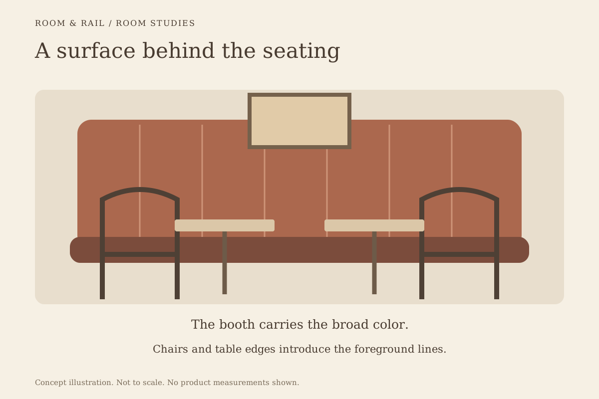
The guide to restaurant booth backs explains how a larger upholstered surface can become part of the room's background. A chair seat may act as a smaller accent beside it. Compare the intended proportions through a room sketch or a clearly labeled arrangement of references.
Table edges deserve similar attention. A small contrasting edge sample can become a repeated horizontal line across the dining area. Include a product image that shows the edge in context, rather than judging its color as an isolated square.
Separate visual approval from material questions
A sample review can establish that the team likes a relationship under the conditions examined. It does not establish cleaning compatibility, use classification, or other performance claims. Ask for the relevant product guidance when those details affect the selection.
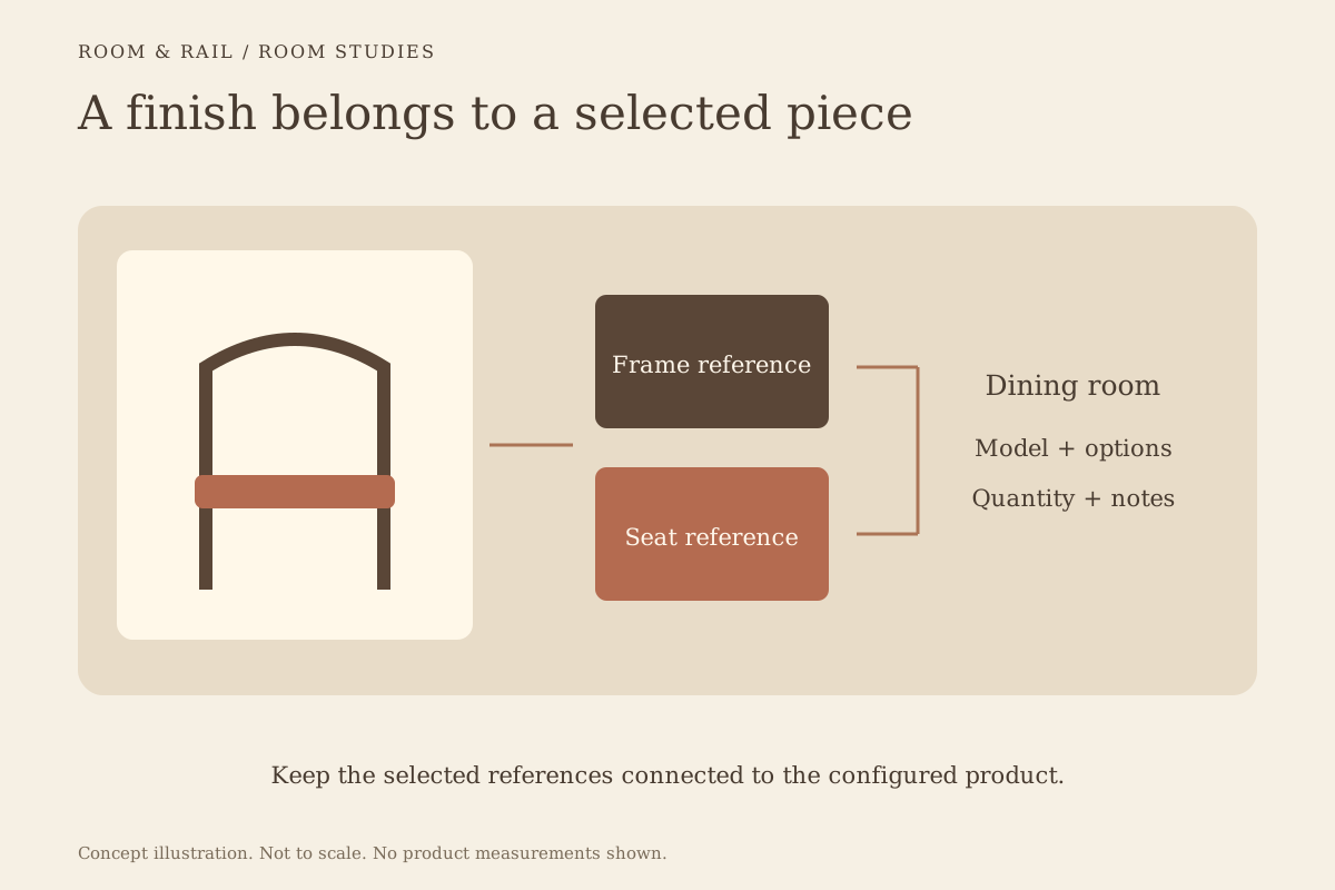
Keep unresolved questions attached to the model and option. If two bar stools use similar seat colors, retain separate records until their exact options are confirmed. Avoid allowing a shared room nickname to replace the actual labels on the configured lines.
The finish-board guide describes the difference between representative product photographs and selected finish references. Use that distinction during approval so a reviewer understands which image identifies the model and which identifies the chosen option.
Record the decision in language others can use
Write down the accepted relationship and any remaining conditions. A note such as warm seat tone accepted beside the existing oak floor is more specific than color approved. Include the product and option identifiers so the statement stays connected to the correct line.
If a finish changes, revisit the nearby samples affected by that change. Do not assume the whole palette remains approved because most products are unchanged. A small revision can alter the relationship that made the original group convincing.
Keep the real reference beside the saved record
Save the selected board and download a current project sheet after the comparison is complete. Retain the physical references where the project team can identify them, together with the decision notes. The saved images help communicate the selection, while the samples preserve the basis for a closer visual check.
Before continuing through ordering, read the configuration labels against that record. The useful result is a clear choice that can be traced from the room comparison to the selected product. It leaves less room for a similar-looking thumbnail or an informal color name to replace the finish the team actually intended.