The room journal
Restaurant booth backs as a room-defining surface
Restaurant booth backs can act like a furnishing and a room surface at the same time. Viewed across the dining area, a run of upholstery may be more noticeable than the loose chairs in front of it. Its color, shape, and visible seams therefore deserve attention early in the palette.
Start by deciding what the booth should contribute to the room. It might provide a quiet background for tables, introduce a broad area of color, or mark the edge of a seating zone. That intention helps narrow the details without asking the booth to perform every visual job at once.
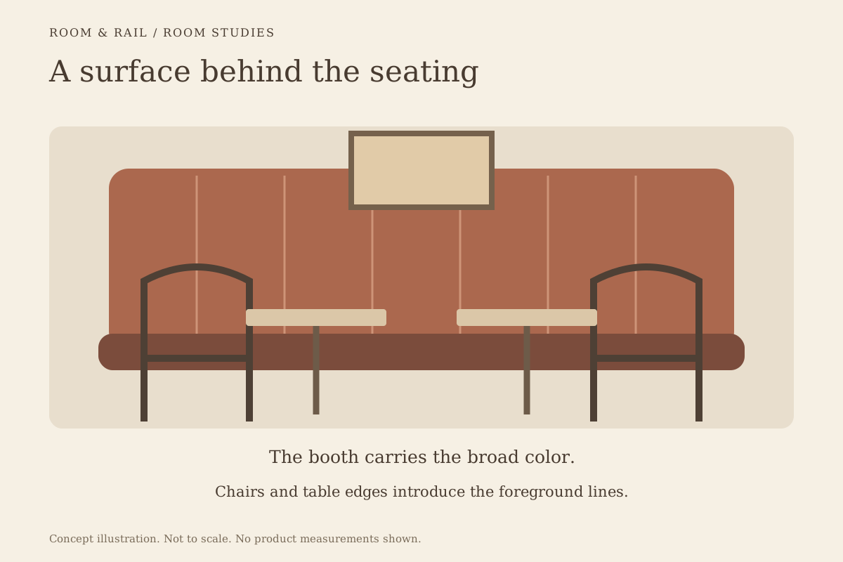
Open diagram at full size (new tab) ↗
Treat the back as an area of color
A small upholstery swatch can be easy to accept. The same color repeated across a long back occupies a different amount of the scene. Consider its relationship to the wall and floor before judging it beside a single chair photograph.
Browse restaurant booths for the offered shapes and configurations, then look at the outline of the proposed arrangement. Keep its actual dimensions in the project record. The room's visual study should use the intended configuration rather than an attractive example with a different size.
Where the back sits against a similarly colored wall, it may become part of a quieter field. A stronger contrast can make the booth a distinct band. Test both possibilities with the real wall reference, since a white catalog background tells you little about that relationship.
Let seams establish their own rhythm
Channeling, panel divisions, and other visible upholstery details introduce lines across the back. Those lines can echo architectural features or become a separate pattern. Look at their direction before choosing a color that makes them more pronounced.
Vertical divisions may meet window mullions or wall paneling in the view. Horizontal divisions may sit beside the tabletop edge or a wall rail. You do not need to align everything, but you should know when several systems of lines will appear together.
Compare the booth with table tops and dining chairs in one simple elevation. Remove decorative objects from the first study. This makes it easier to see whether the furniture details create a clear rhythm or a collection of unrelated stripes.
Choose what loose chairs should add
The chairs opposite the booth can support its broad surface through a lighter outline, or introduce another upholstered shape. The useful question is what the room needs beside the booth, rather than whether the two products share a range name.
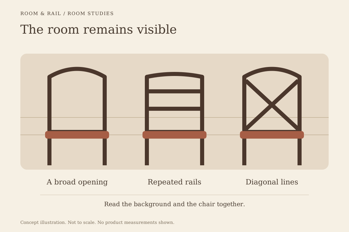
An open-backed chair leaves portions of the booth visible through its frame. A more enclosed chair back places another surface in front of it. Compare these views from the entrance, where several seating positions may overlap.
The guide to open-back restaurant chairs develops that specific comparison. Keep the seat and frame references separate on the finish board, particularly when the chair upholstery is intended to relate to the booth without being an exact match.
Examine the ends and exposed rear
The front of a booth is not always its most prominent view. An end panel may face the entrance, while a freestanding arrangement can expose the rear to another seating zone. Those surfaces belong in the selection review from the beginning.
Check the product images and descriptions for the areas that will be visible in your layout. If the relevant detail is not shown, request it before assuming that an unseen panel matches the front upholstery. A room note should identify the missing view rather than hide the uncertainty.
Use planning guidance to keep the booth's position connected to the measured arrangement. An attractive end profile does not establish circulation or the available space beside the unit. Treat the visual elevation and the layout as related documents with different purposes.
Work with the wall behind the booth
Patterned walls and detailed booth backs can make an energetic combination, but the balance deserves a deliberate test. A wall motif may become partly hidden by the furniture, leaving fragments visible above and beside the upholstery.
Try a plain block representing the booth before adding its seam pattern. That first comparison reveals how much of the wall remains visible. Then add the furniture detail to see whether both patterns still have a readable place in the composition.
The materials page can help keep the actual upholstery and frame descriptions precise. A visual board should not turn a texture seen in a photograph into an unsupported material claim. Retain the manufacturer's option label for the selected version while using plain design notes to describe its role.
Consider the neighboring zones
If the booth runs toward a bar, its upholstery can relate to the bar stools without copying their full design. The booth might carry the room's deeper color while the stools repeat a smaller accent. Check the transition from the viewpoint where both are visible.
Near lounge seating, compare the proportions of the upholstered surfaces. Several large backs can occupy much of the view, particularly in a compact room. A quieter material relationship may give those shapes enough space to remain distinct.
This review can also reveal where a design connection is unnecessary. A partly enclosed dining area may feel complete with a more independent booth palette. Let the actual sightline determine the strength of the relationship instead of applying the same finish everywhere.
Keep the selected upholstery identifiable
Save the booth's offered configuration and finish together. Separate alternatives into clearly named board versions, rather than placing several swatches beside one model with no indication of the chosen one. The finish-board guide explains how to keep those records readable.
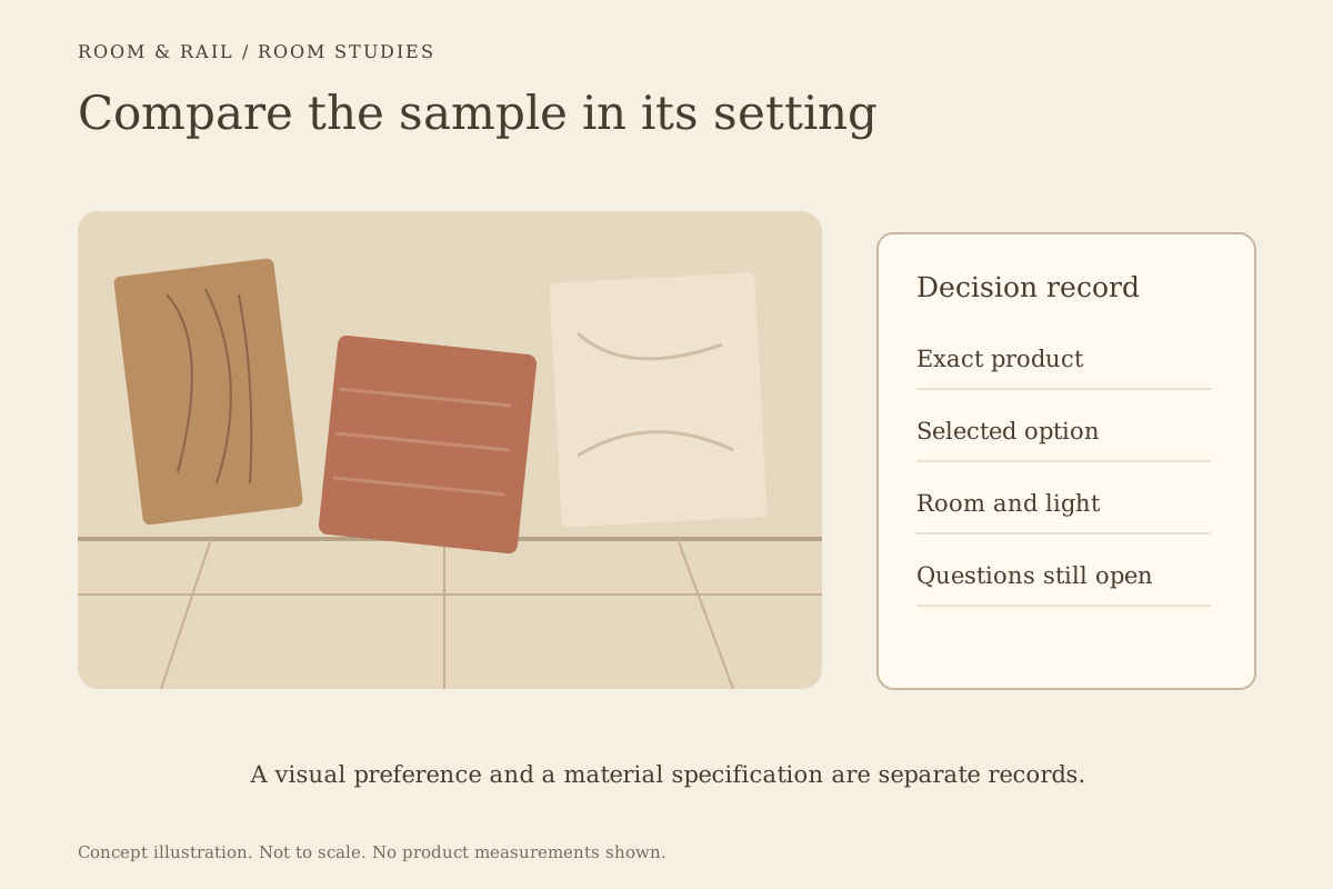
Review physical references where the project depends on a close color relationship. Lighting and display conditions can change the appearance of a digital sample. The board can organize the decision, but a selected thumbnail alone does not complete a material approval.
Allow the booth to set a calm reference
Once the direction is chosen, look again at the tables, chairs, and wall beside the booth. Decide which of those details should support its surface and which should remain independent. The shape and proportion guide can help keep that final comparison focused on relationships.
Write one sentence explaining the booth's role in the room. It might be the continuous warm surface behind lighter chairs, or the plain backdrop beside a patterned wall. That sentence gives future substitutions something concrete to preserve, even if an individual finish or neighboring piece changes.