The room journal
Outdoor restaurant furniture that belongs to the indoor palette
Outdoor restaurant furniture can share a visual relationship with the dining room while remaining a separate product selection. Through a glazed wall or open doorway, a repeated curve or related color can make the two areas feel connected. The connection does not require the same chair on both sides of the threshold.
Begin with the view between the spaces. A terrace seen from the entrance may form part of the restaurant's first impression. A hidden courtyard can carry a more independent palette. Decide which materials and shapes should travel across that view before looking for a direct match.
Open diagram at full size (new tab) ↗
Map the parts of the indoor room that remain visible
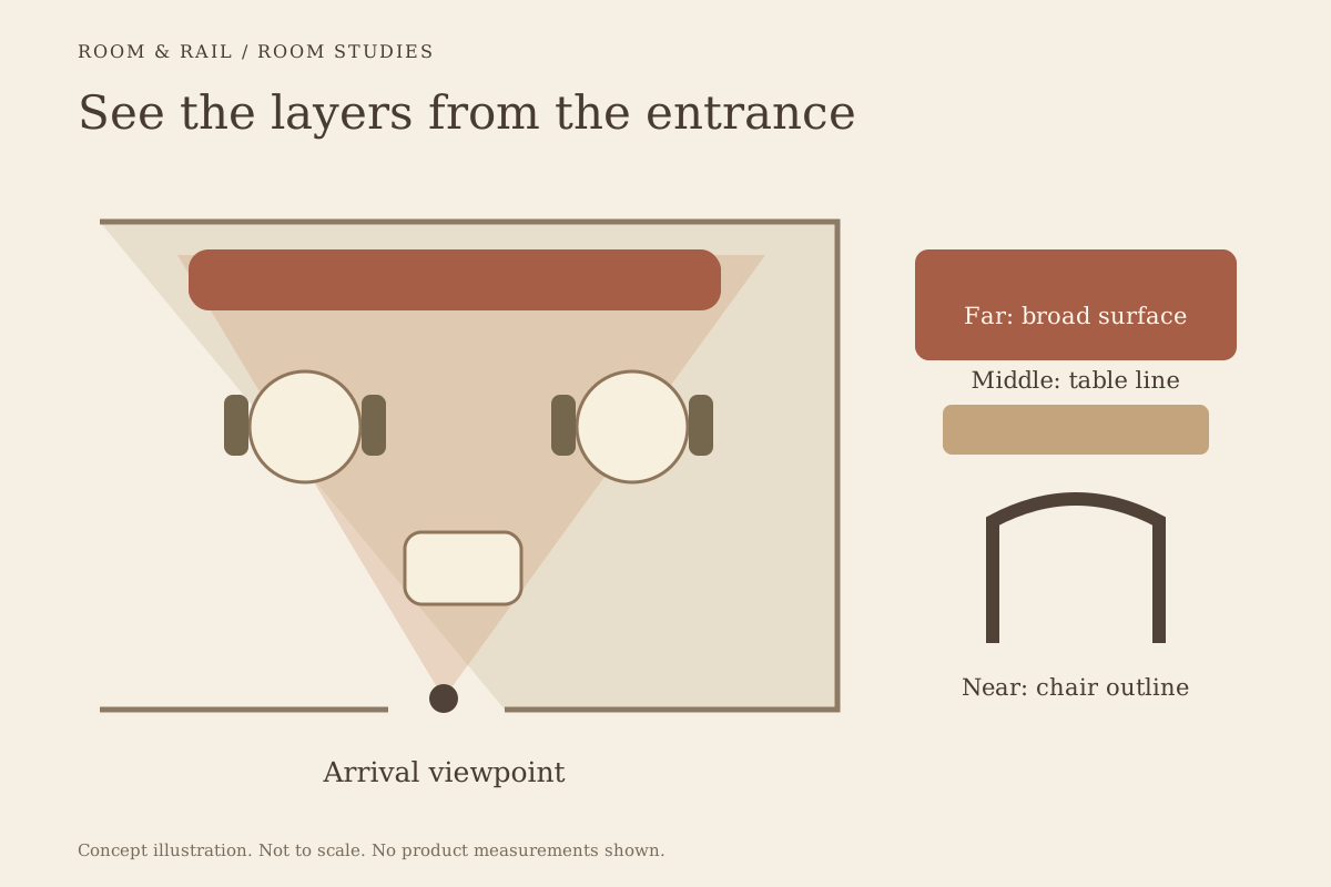
Stand at the doorway or window that joins the areas and note what can be seen from each side. The indoor floor, table edges, and chair backs may all remain prominent outside. From inside, the exterior paving and building facade may become a background to the furniture.
Use the furniture directory to compare categories within that shared scene. Do not begin with every surface in both rooms. Select the few references that actually meet in the view, then add the fixed background materials that influence their appearance.
A simple sketch can identify the transition more clearly than a crowded mood board. Mark the doorway, the visible seating groups, and the materials on either side. Keep this visual study beside the measured room plan. Read the room planning guide for the separate fit and circulation review.
Carry a relationship rather than an identical product
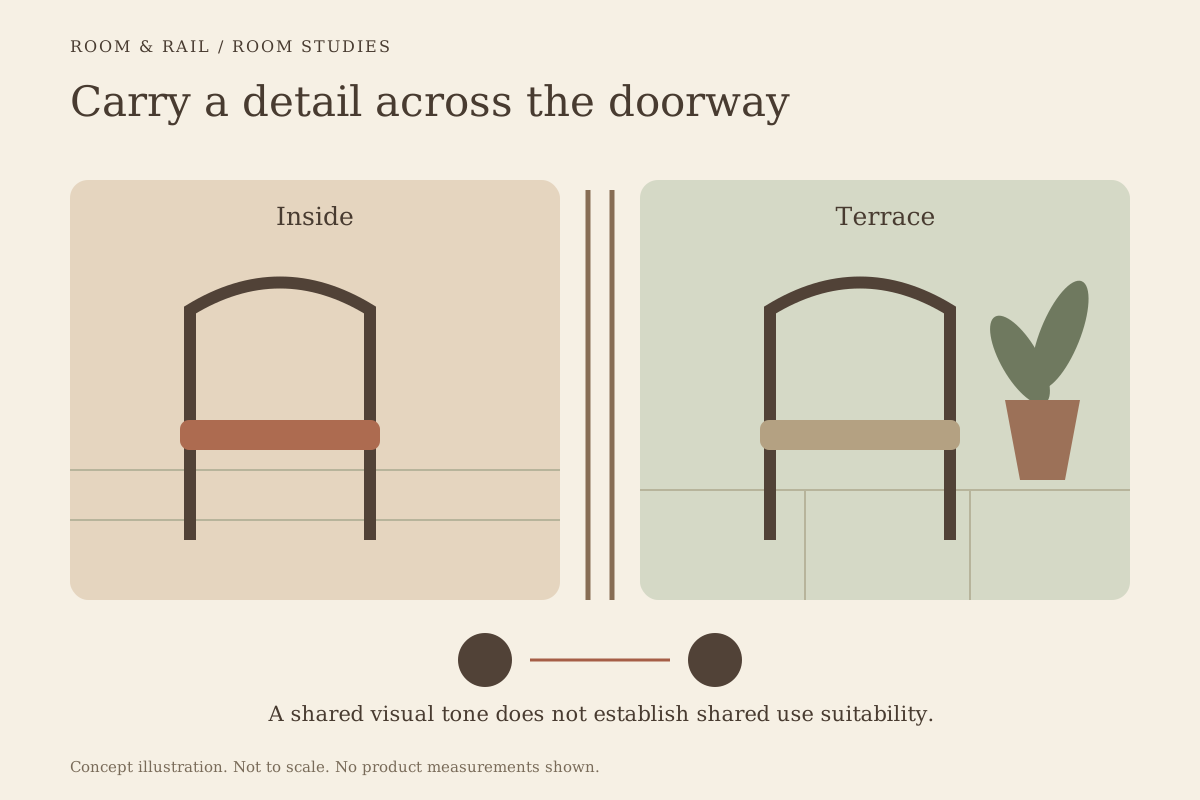
The indoor dining area might use a curved wood chair. Outside, a different chair could repeat the broad curve while using another stated material. Alternatively, the indoor seat color might relate to an exterior tabletop without appearing on the outdoor seating at all.
Browse outdoor furniture and indoor dining chairs as separate selections. A similar appearance does not establish that a product is suitable for both settings. Read the use classification and any restrictions on the individual listing before considering the visual connection settled.
The materials guidance helps keep those distinctions explicit. A wood-like surface, a woven pattern, and a metal finish should retain their actual descriptions. The board can describe a shared warm tone without claiming that two visibly similar pieces use the same construction.
Let the threshold contain a controlled change
The place where the indoor floor meets the exterior paving already introduces a change of material. Furniture can acknowledge that transition instead of trying to disguise it. A repeated frame color with a different seat texture is one possible approach.
Review the doorway view with both furniture groups present. If several finishes change at once, identify which feature still connects the areas. If every visible detail repeats, ask whether the outside space has enough relationship to its own paving, planting, and surrounding walls.
Keep the intended connection in a short note on the finish board. A phrase such as related curves with different surface textures is more useful than simply writing matching patio furniture. It tells the next reviewer what matters and leaves room for products that suit their stated use.
Compare colors in their different light
An indoor reference seen under room lighting and an outdoor reference seen in daylight may not appear identical. Evaluate physical samples in the relevant positions when a close relationship matters. Screens can organize the options but cannot settle that comparison.
Include the actual fixed materials in the review. Pale paving can become a large visible surface around darker chair frames, while a brick wall introduces another warm tone. Judge the furniture against those backgrounds rather than the white field around a catalog image.
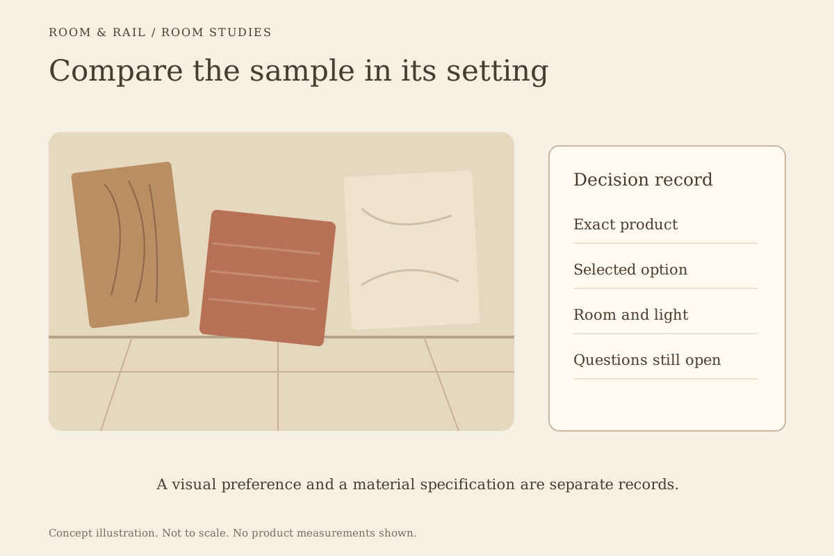
The finish-board workflow keeps selected labels alongside visual references. Retain separate labels for indoor and outdoor products even when the colors look related. That record prevents a visual shorthand from becoming an incorrect assumption about the ordered finish.
Connect tables and seating across categories
The visual link does not have to run from chair to chair. An indoor tabletop may echo the color of an outdoor frame, while the exterior table introduces a quieter surface beside planting. Cross-category relationships can leave each room more freedom.
Check the complete outdoor table selection at the product level. A separate top and base need a confirmed compatible pairing and an appropriate stated use. An indoor component does not become an exterior option because its color completes the palette.
Where an outdoor counter is visible from the dining room, compare its stools with the indoor bar seating. The guide to connecting stools and dining chairs offers a useful way to choose one shared detail while allowing different silhouettes.
Give planting and shade their place in the scheme
Furniture outdoors is seen beside elements that may occupy more of the view than the seating itself. Plant containers, foliage, shade structures, and railings can all affect the composition. Include the known fixed selections before adding more furniture colors.
A neutral chair frame might leave a patterned paving surface visible, while a stronger seat color might relate to the facade. These are design comparisons to test rather than promises about how every terrace should look. The amount of visible furniture and the background will differ by project.
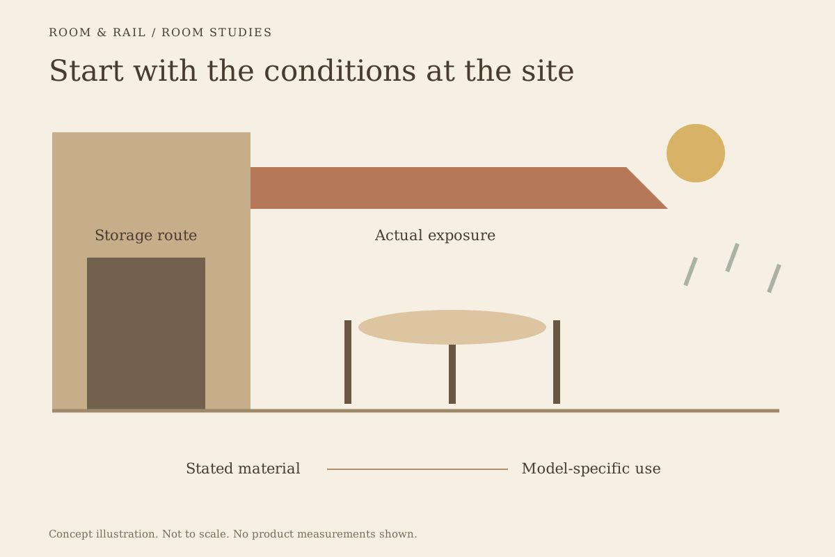
Keep any shade product's size, suitability, and installation questions in a separate confirmation record. A palette illustration does not establish wind suitability or coverage. Where information is missing, retain the question instead of filling it with an estimate based on a photograph.
Keep the two areas clear in the saved board
Name indoor and outdoor groups separately, even when they belong to one project. That makes the product classifications and selected finishes easier to review. If you duplicate a room to test the exterior scheme, replace any unsuitable products rather than carrying them forward with a new room name.
Use the shape and proportion guide to review how the new pieces relate to each other. Similar colors do not settle proportions, and a copied quantity does not establish that the arrangement fits the terrace. Save the updated version before sharing its project sheet.
Make the view across the doorway deliberate
Return to the connecting sightline with the final references. Look for the detail that was meant to travel between the rooms, then check whether each area still belongs to its own setting. Remove an unnecessary repeated finish if it makes the relationship feel forced.
Carry the material and use questions into the order review with the selected products. The finished scheme should make the indoor and outdoor spaces feel considered together while keeping their actual specifications distinct. That clarity helps the design survive the move from an attractive board to a usable furniture selection.