The room journal
Restaurant bar stools that connect to dining chairs without matching
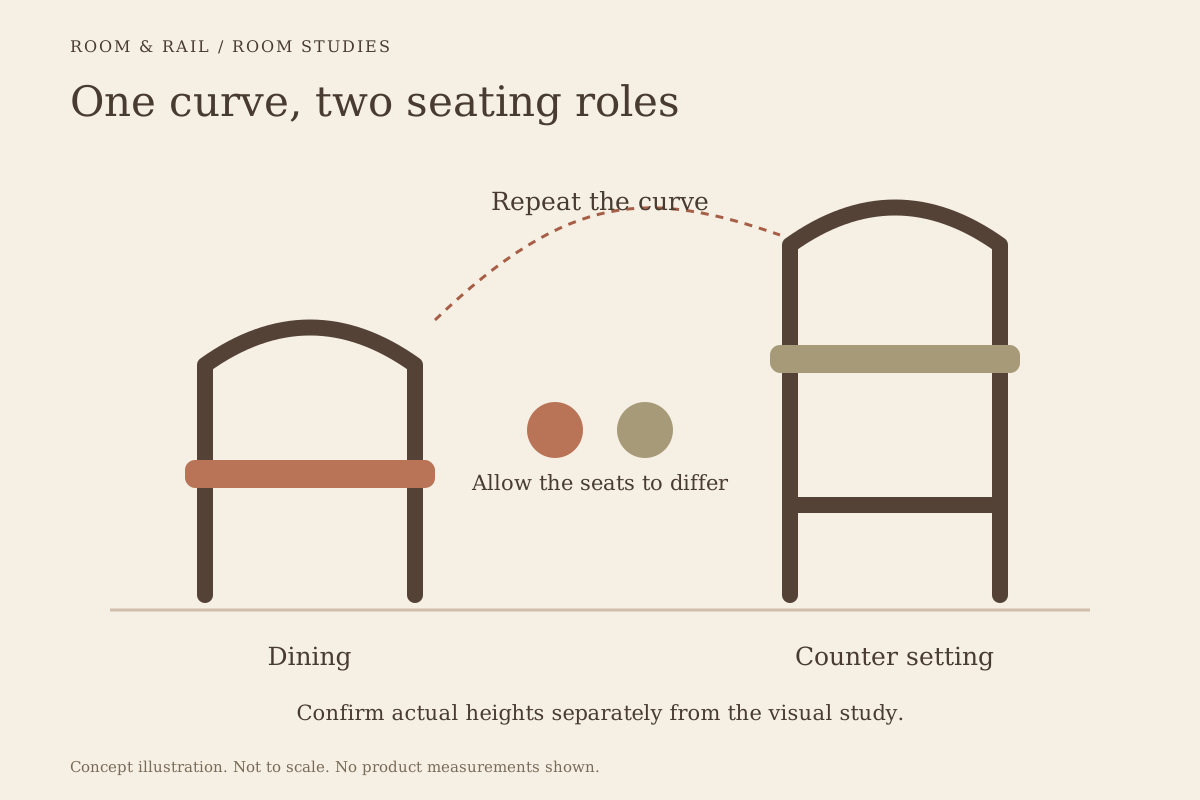
Restaurant bar stools and dining chairs can feel related without sharing the same outline. A curved back at the bar might answer a rounded dining chair, while a repeated seat color connects two different frame materials. The relationship can be small and still read clearly across the room.
Start by deciding how much connection the spaces need. A bar visible from every table may benefit from a close material conversation. A separate room can carry a more independent selection. The aim is a clear reason for the connection, rather than a matching set chosen before the room has been considered.
Open diagram at full size (new tab) ↗
Choose the feature that should travel
Lay out the dining chair and bar stool references side by side. List the visible details of each: the back outline, frame tone, seat surface, and lower supports. Select one feature that could repeat without forcing the rest of the design to follow.
The dining chair collection and bar stool collection offer separate starting points. You may find a shared curve between unrelated models or a similar contrast between frame and seat. Describe that relationship plainly, such as dark frames with warm seats, before narrowing the options.
Avoid treating a shared finish name as the connection by itself. The name may refer to different materials, surface treatments, or visual tones on separate products. Compare the actual references and retain the product-specific labels, using the materials notes when the terminology needs clarification.
Make room for a different silhouette
The bar stool is seen at another height and often against a different background. Its back may sit in front of the bar top, shelving, or a wall feature, while the dining chair is read against tables and the floor. A matching shape can therefore have a different effect in each position.
Consider whether the bar should be a quieter continuation or a stronger feature. A simple stool beside a detailed chair can reduce competing lines. A more expressive stool can make the counter a deliberate focal area, provided nearby furniture leaves enough visual space around it.
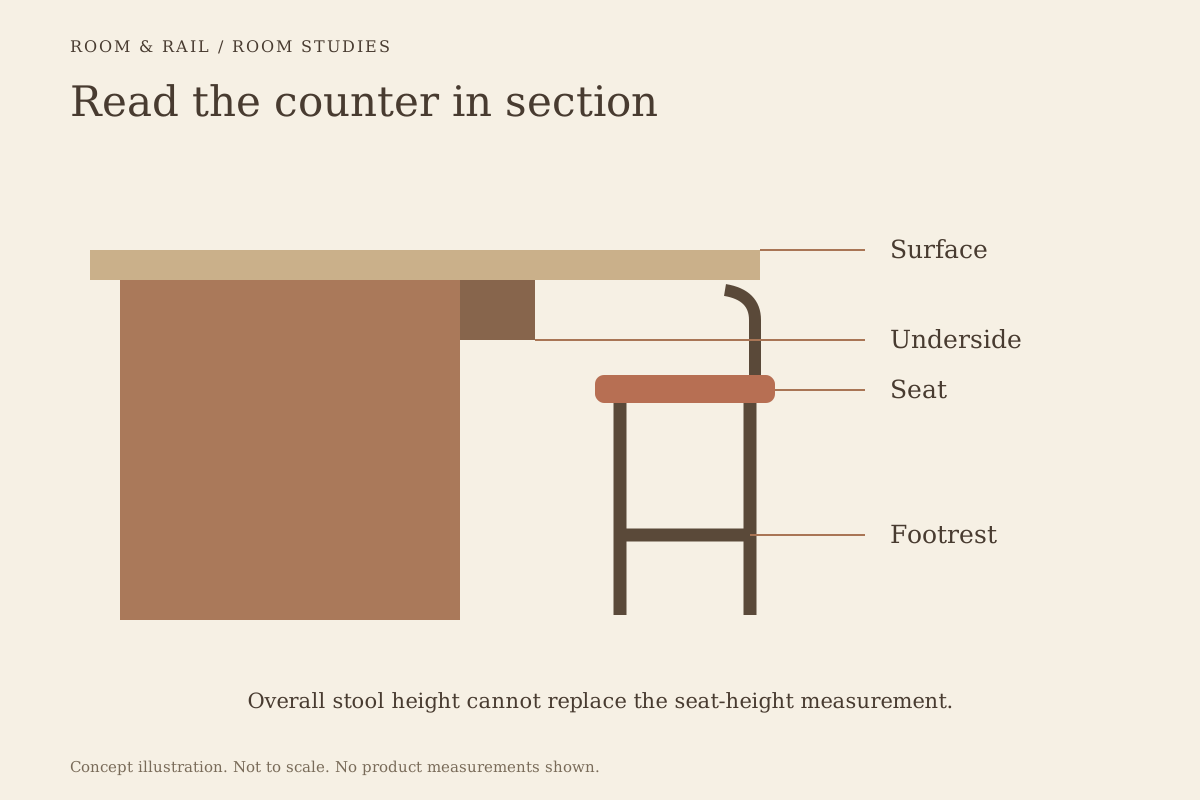
Keep the physical fit separate from that visual decision. The appropriate seat height and the relationship to the counter must come from the actual measurements. A matching range does not settle those dimensions. Keep pairing questions in your project record and read the room planning guide before assessing the actual arrangement.
Read the counter as a third participant
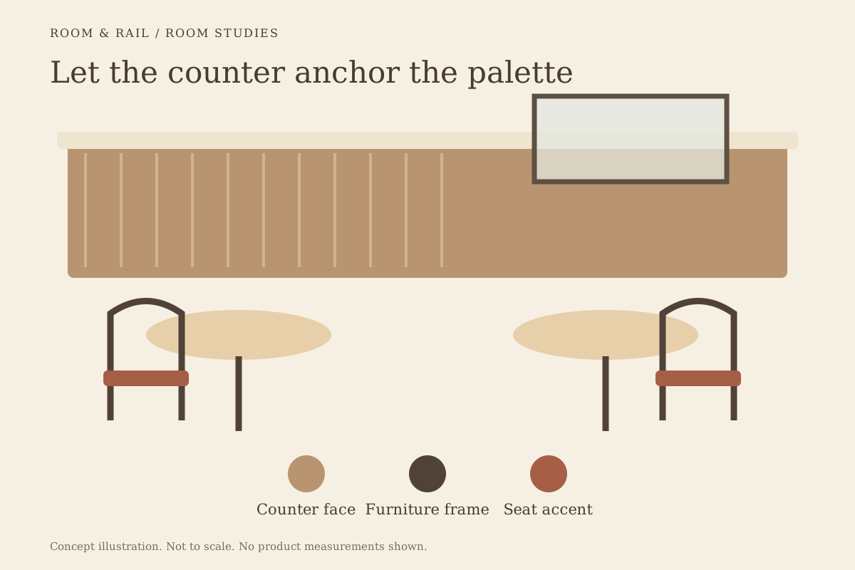
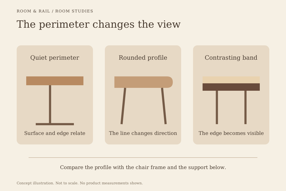
Chairs and stools are rarely seen alone together. The counter front, top, and nearby table surfaces complete the scene. Their colors and edges may provide the connection even when the two seating types are quite different.
For example, a wood tone on the dining chair could relate to the counter face while the stool repeats the darker table support. This is a proposed composition to test, not a requirement to match every material. A simple board with those four surfaces can make the relationships easier to see.
The table base collection is useful when the lower part of the room is visible from the entrance. Stool legs, chair legs, and table supports can form a separate layer below the brighter tops. Give that layer attention instead of reviewing only seats and backs.
Use color with an identifiable role
A repeated upholstery color is an easy connection to notice, but decide where it begins and ends. It could appear on all dining seats and only selected bar stools, or remain exclusive to the bar. Either choice needs a clear record so a mixed reference board does not imply an unintended order.
Save each configuration on the finish board with its own selected options. Where two products offer similarly named colors, keep their labels distinct. A physical sample comparison may still be needed before the team accepts them as a close visual match.
Sometimes a looser relationship is more convincing. A warm neutral stool seat and a deeper warm dining seat can belong together without pretending to be identical. Test that difference beside the counter and table surfaces, where the contrast will actually be seen.
Compare the spaces from their shared viewpoint
Find the position where both seating areas are most clearly visible. That might be the entrance, a central aisle, or a seat facing the bar. Study the composition from there before spending time on views that show only one area.
Look for repeated lines as well as repeated colors. If the stool back, bar shelving, and chair rails all introduce strong horizontals, the room may feel more striped than the individual images suggest. A curved or quieter silhouette can be worth comparing.
The shape and proportion guide helps frame this review. Keep the observed sightline in the room notes, especially if another person will review the selections remotely. A front-facing product image cannot explain the full relationship by itself.
Let a booth bridge the two areas
Where booth seating sits between the bar and loose dining furniture, its larger upholstered surface can connect the two. It might repeat a seat color from one area and a wood tone from the other. That can make an exact chair-to-stool match unnecessary.
Check the booth's visual weight before adding another repeated detail. A broad, strongly colored back may already dominate the view. The chairs and stools can support it through simpler surfaces, rather than each carrying the same strong pattern.
If there is also a lounge area, review its benches and lounge seating in the same composition. Add the reference only when it clarifies the room. A board containing every attractive product can make the relationships harder to judge.
Save the connection, not an assumption
Once the direction is settled, give the dining and bar groups clear names. Record the specific detail they share and the differences that are intentional. The finish-board guide explains how separate configured lines keep those decisions readable.
Review any later substitution against that note. A new stool might preserve the frame color while losing the curve that originally connected it to the chairs. The note makes that trade visible before a revision is accepted.
Let each seating height belong to the room
The final pairing should read well in its surroundings and retain the right information for each product. Check the selected finishes, the relevant dimensions, and any unresolved material comparison before continuing to the order review.
A considered connection leaves room for difference. The bar can have its own character while still belonging to the dining room, and a chair can be chosen for its place at the table rather than its resemblance to a stool. Keep the shared feature clear, then allow the remaining details to serve their own positions.