The room journal
Wood restaurant chairs beside wood floors: working with different tones
Wood restaurant chairs and wood floors do not have to share one finish name to look considered together. The floor forms a large background, while the chair introduces smaller vertical and horizontal surfaces above it. A clear difference can be easier to read than two tones that nearly match but never quite settle.
Begin with the floor as it will remain in the finished room. Its color, visible grain, and pattern already occupy a substantial part of the palette. Choose how the chairs should relate to that surface before adding another wood tone through the tables or counter.
Open diagram at full size (new tab) ↗
Describe the floor without reducing it to a label
Words such as natural, walnut, or oak may identify a reference, but they do not fully describe its appearance in the room. Note whether the visible surface looks pale or deep, warm or comparatively cool, and strongly patterned or quiet. Use actual material records for its construction.
Take the reference from the installed floor where possible. A spare piece may be helpful, but compare it with the room itself before assuming the appearance is identical. Keep the conditions of the review in the project notes, particularly if the floor is being refinished.
Browse wood restaurant chairs with that reference beside the screen. The purpose is to identify promising relationships, not approve a close match digitally. The finish-sample guide explains how a later physical comparison can make the decision more specific.
Choose between connection and contrast
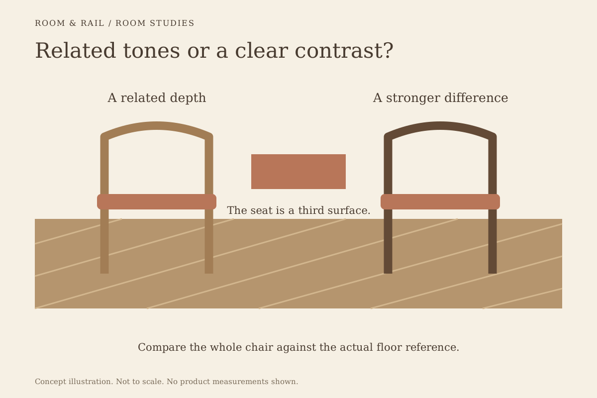
One approach is to keep the chair within a related family of tones while allowing a visible difference in depth. Another is to contrast the chair more clearly with the floor. Either can work as a design choice when the surrounding materials support it.
Avoid describing the goal simply as matching wood. That phrase leaves open whether the team expects an exact color relationship, a similar grain effect, or a broader warmth. Write the intended connection in language that a later reviewer can test.
Save the configured chair on the finish board, and compare it with the floor reference in your wider design record. Keep the selected frame label and the specific model beside that comparison. If several options remain possible, use separate lines or versions so the choice stays visible.
Read the chair's shape against the floor pattern
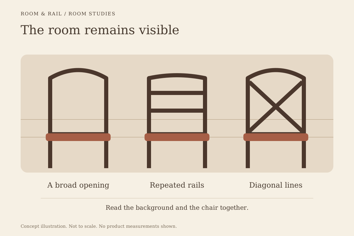
A strongly patterned floor can remain visible between the chair legs and through an open back. The chair's lines become part of that view. Compare the floor direction with the frame geometry instead of judging the two finishes as adjacent swatches alone.
The guide to open-back restaurant chairs looks at how those openings reveal their background. A crossed frame may introduce another diagonal pattern, while a simpler opening can leave more of the floor and neighboring furniture visible.
Look across several dining-chair shapes before deciding that the finish is the problem. A different silhouette can change the relationship without changing the color family. Keep the listed dimensions with the product so the visual comparison remains connected to the actual piece.
Let the seat interrupt the wood relationship
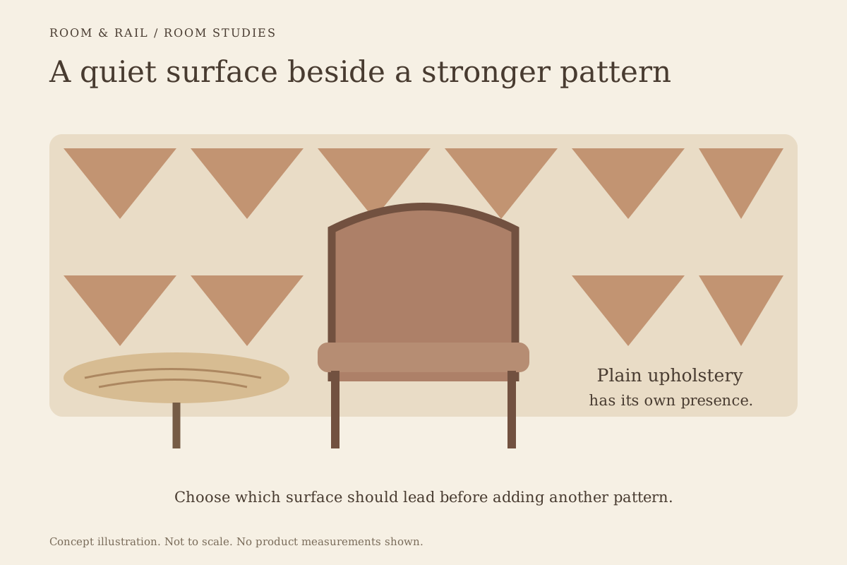
An upholstered seat can create a deliberate break between the chair frame and the floor. It might repeat a wall color, relate to a booth, or remain a restrained neutral. That third surface can make two wood tones feel less dependent on a close match.
Compare the seat option as part of the configured chair. A swatch chosen from another product is not evidence that the same upholstery is available for this model. Read the offered controls and retain the exact option label beside its reference.
The materials notes help keep the visible seat and frame descriptions separate. If the proposed combination depends on a material detail not recorded for the product, keep it as a question. Do not let a successful color pairing stand in for that missing information.
Decide what the tabletop should contribute
Adding wood-look or wood table surfaces introduces another area above the floor. Decide whether the table should repeat the chair's tone, relate more closely to the floor, or provide a quieter contrast. Avoid choosing it independently and hoping the group will settle later.
The table edge may be more visible than the top from some positions. Use the table edge guide to compare that perimeter beside the chair frame. A darker band can add a clear line even when the upper surface is relatively pale.
Check the support below the top as well. Table bases can repeat a darker room detail and separate the tabletop visually from the wood floor. Confirm any top-and-base pairing independently of the palette decision.
Review the room beyond the furniture group
Existing millwork, doors, or a timber counter may already introduce more wood surfaces than the furniture board shows. Include the visible ones before accepting the chair finish. A good chair-to-floor comparison can still become crowded when the rest of the room enters the view.
Choose which relationship should lead. Perhaps the chair relates to the counter while contrasting with the floor, leaving the table more neutral. A written note about that hierarchy is more useful than trying to make every wood surface appear identical.
The sightline guide can help identify the positions where these surfaces overlap. Review the entrance view and a seated view separately. The floor may dominate one while the tabletop and counter occupy more of the other.
Use a physical comparison for a close relationship
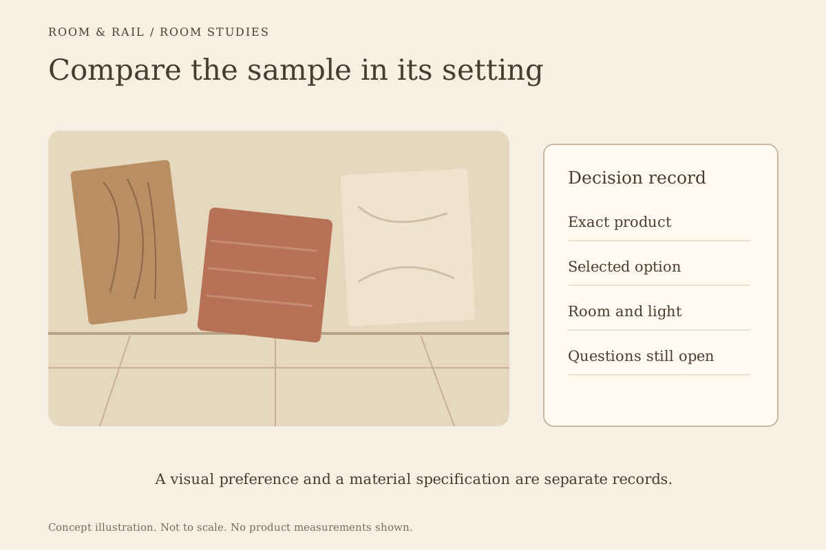
When the design depends on a narrow difference between finishes, arrange the appropriate references in the actual room. View them beside the floor under the lighting conditions that matter to the project. Keep a record of which exact options were compared.
The finish-board workflow keeps those decisions connected to the selected furniture. Save the board after approval and retain any unresolved questions. A downloaded sheet should identify the chosen configuration rather than every alternative considered during the review.
Give the wood tones room to differ
Return to the original intention before finalizing the selection. If the goal was a clear contrast, do not keep narrowing the difference until the chair nearly disappears into the floor. If the goal was a related warmth, check that a later seat or tabletop change has not altered the overall balance.
Keep the relationship understandable rather than chasing a shared finish name. The floor and the chair occupy different places in the room, and a deliberate difference can help each remain readable. A precise board preserves that choice when the project moves from visual comparison to a specific furniture order.